
Project overview
Responsive website for a movie theatre. The target users are all kind of movie-goers, who prefer buying tickets online beforehand, enjoy spending time by getting deep into movie related content or just want to learn more about the theatre before they go there.
- Users (busy working people) need an easy and fast way to buy movie tickets online in advance, so there is no need to wait in lines in front of the box office.
- Users (movie enthusiasts) want to get enough of the most recent movie related content for making informed buying decisions and spending free time.
- Users lack accessibility like language support, colour contrast, screen readers, etc
- Users want to stay updated about movie promos and different events in the cinema.
- Users want to know about cinema’s restaurants, cafes and facilities.
UX Designing this movie theatre app from conception to delivery
- The main goal of the project was to create website for a movie theatre, that allows all kind of movie goers to search for movies effectively and buy tickets easy and fast.
- Additional goals were to allows movie enthusiasts enjoy spending time on different movie related content on the website.
- Provide moviegoers with all information they may want to learn about the theatre.
- Conducting interviews and user research
- competitor’s analyses
- Paper and digital wire-framing
- Low and high-fidelity prototyping
- Conducting usability studies
- Accounting for accessibility
- Iterating on design
User research summary
Through interviews, I learned that many movie-goers want to buy tickets online because of it convenience and some users want to avoid frustration when trying to purchase tickets in person, especially during peak times when lines can be long and seats can sell out quickly. This pain point was compounded by issues with parking and traffic, which could cause delays and impact arrival times.
We also discovered that many movie-goers value the convenience of being able to browse show times and select seats from their desktops or laptops as well as the ability to receive personalized movie recommendations. Some users also expressed concerns around the security of online transactions and the difficulty of navigating websites that were poorly designed or hard to use. Finally users also expressed interest about learning the theatre itself.
We also discovered that many movie-goers value the convenience of being able to browse show times and select seats from their desktops or laptops as well as the ability to receive personalized movie recommendations. Some users also expressed concerns around the security of online transactions and the difficulty of navigating websites that were poorly designed or hard to use. Finally users also expressed interest about learning the theatre itself.
Pain points
- Waiting in lineUser needs an easy and convenient way to purchase movie tickets without waiting in line
- Seat and time selectionUser needs an ability to select the preferred seat and movie showtime in advance
- Tough-budgetUser wants to earn rewards, loyalty points for using the app or get discounts to save some money.
- Payment processUser needs seamless and secure payment options.
Persona

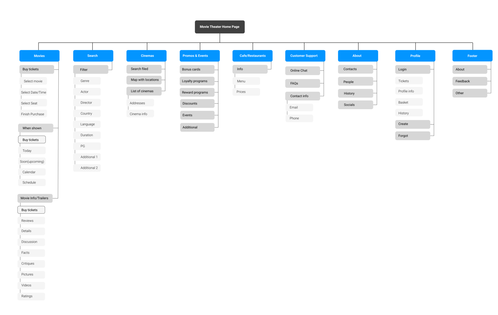
Sitemap
When I was creating a site map for a movie theatre website, I wanted to create a such place for a movie enthusiasts where they will find all possible information about the movies and the theatre in the most complete manner fast and easy but not to overwhelm them with information.
My goal was to create more than just a website to represent a theatre but a place you want to visit again and again, because here you can have a great time learning about movies, taking parts in discussions and getting info about events you will want to visit and staying updated with promos and discounts.
My goal was to create more than just a website to represent a theatre but a place you want to visit again and again, because here you can have a great time learning about movies, taking parts in discussions and getting info about events you will want to visit and staying updated with promos and discounts.
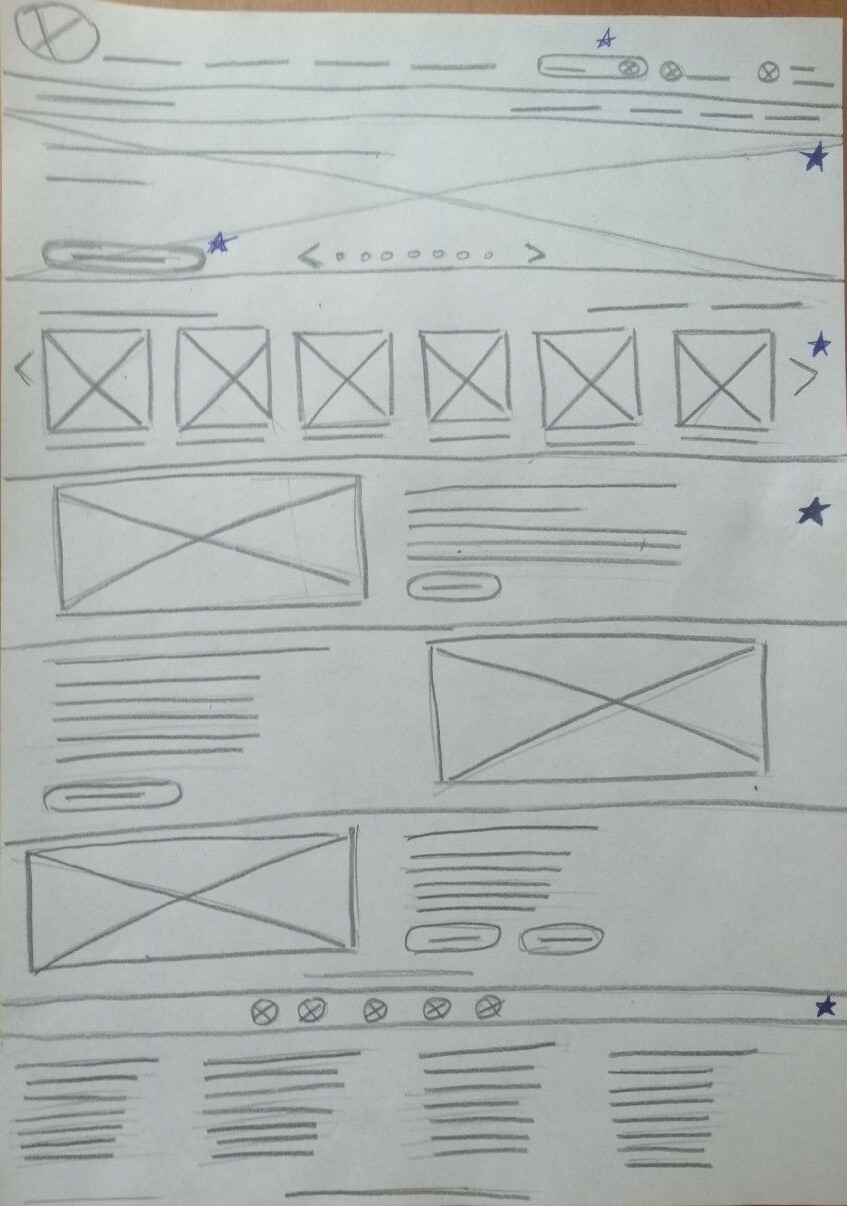
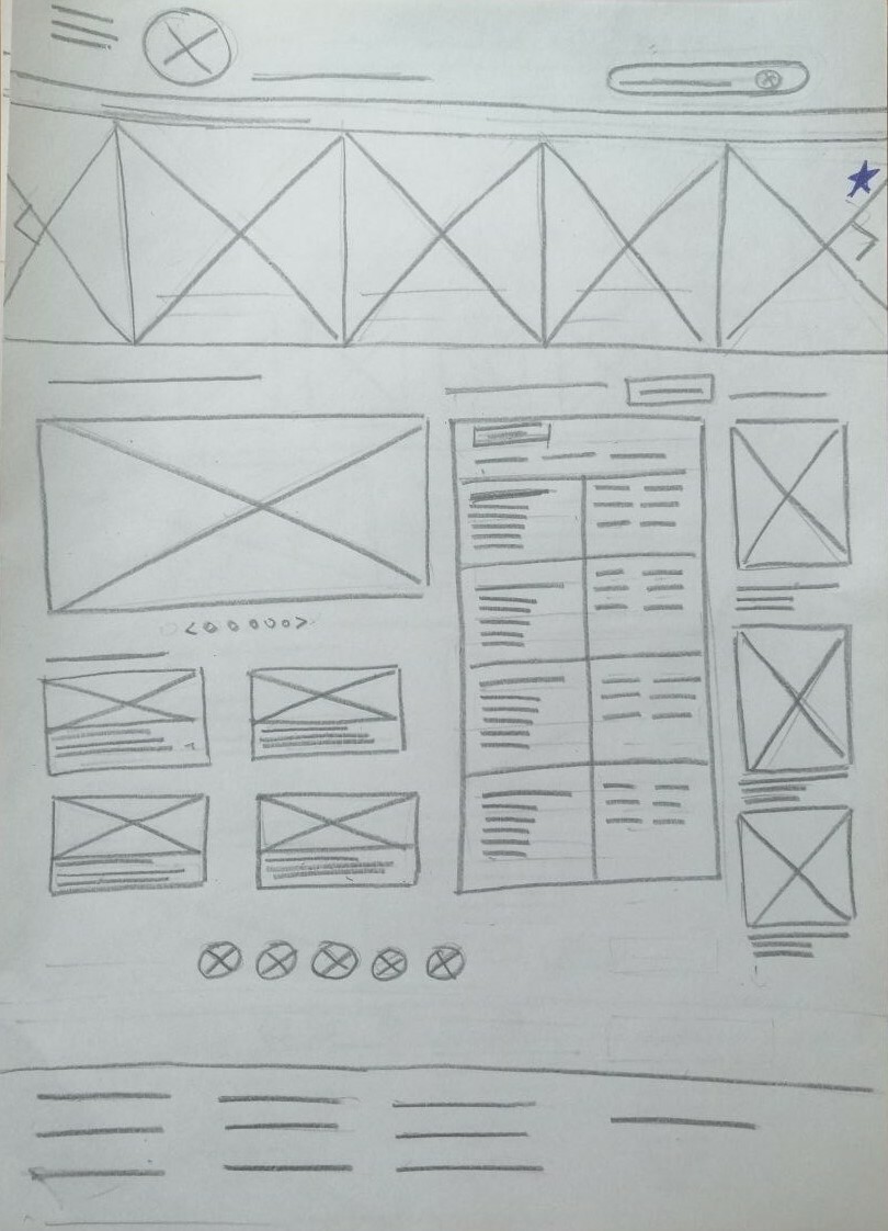
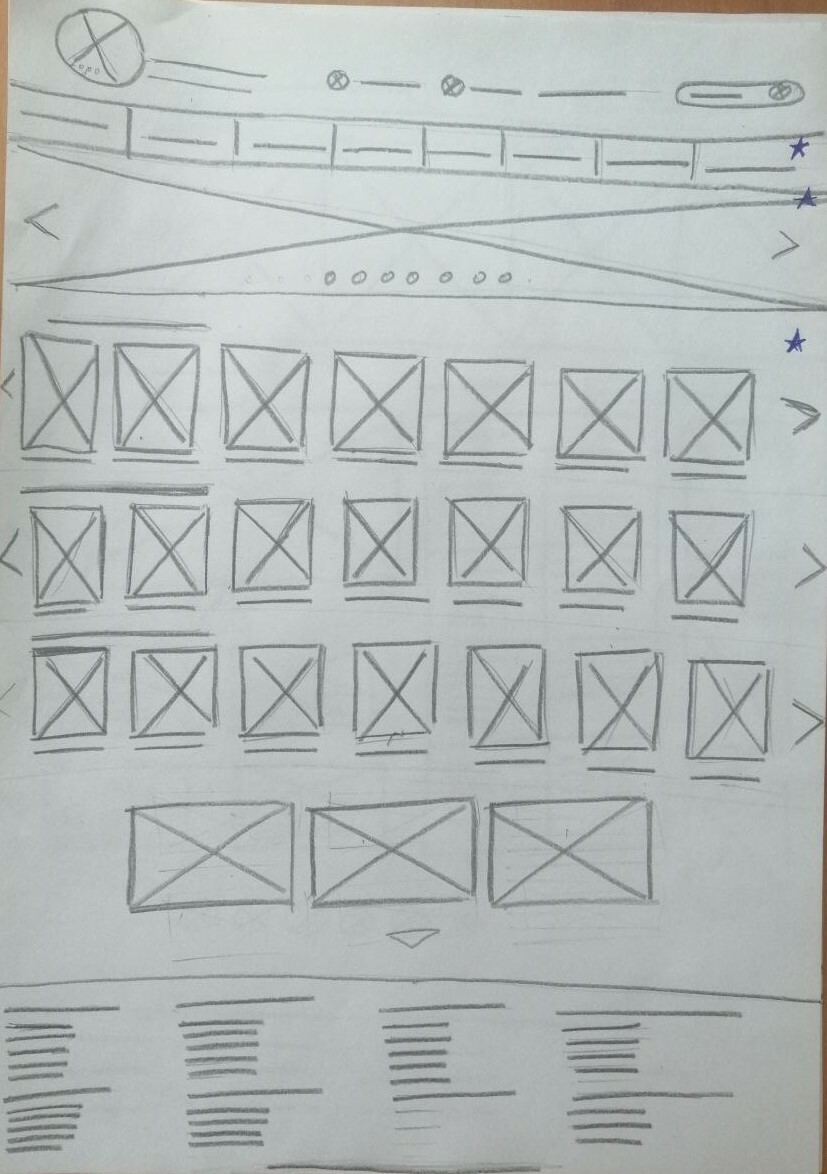
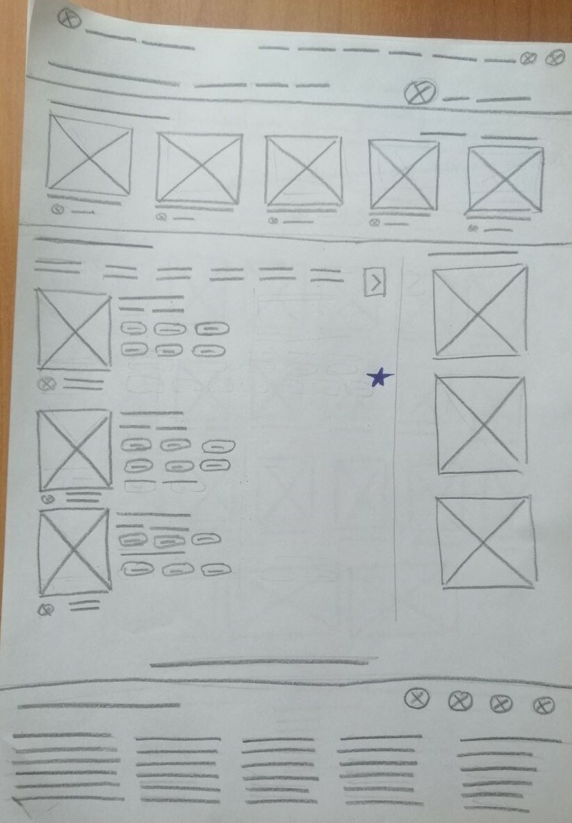
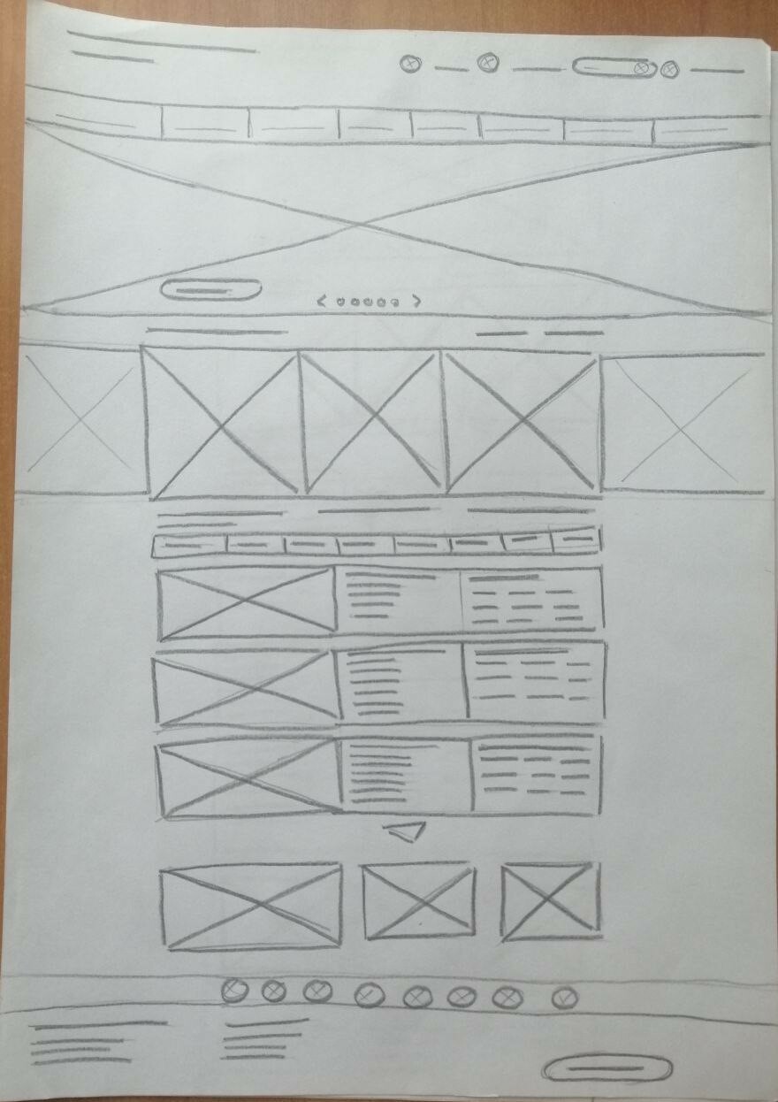
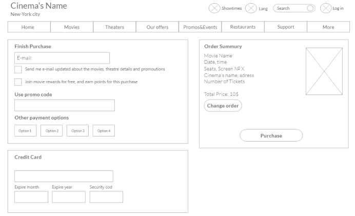
Paper Wireframes
Next, I sketched out paper wire frames for each screen for my movie theatre website, keeping the user pain points about getting the most relevant information about promos, events, discounts and show times.
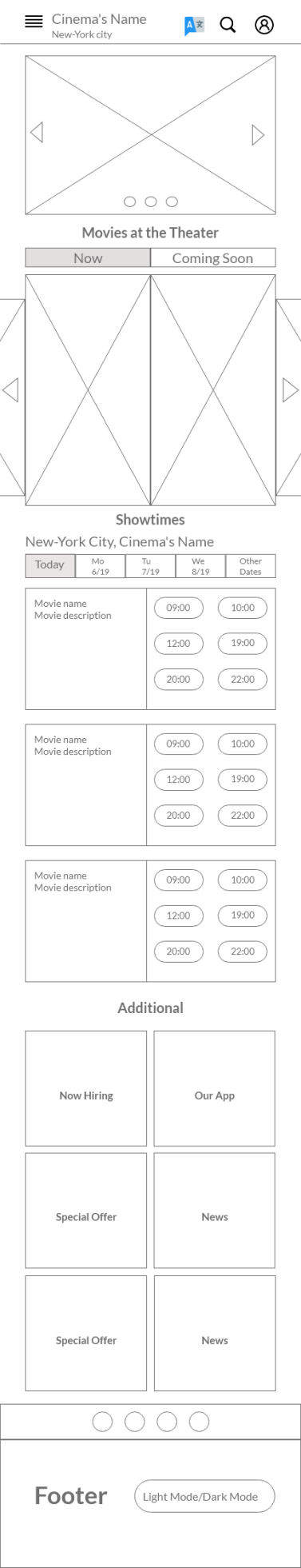
Digital wireframes
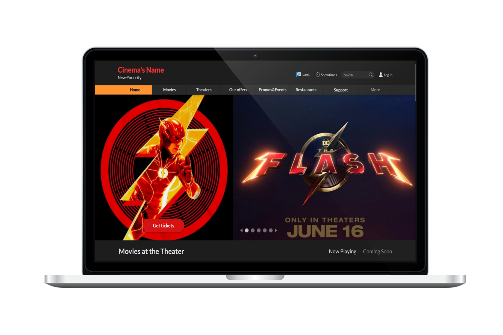
The goal of the homepage was to let the user find the most important info the movie theatre has to offer right after the moviegoer visits the website.
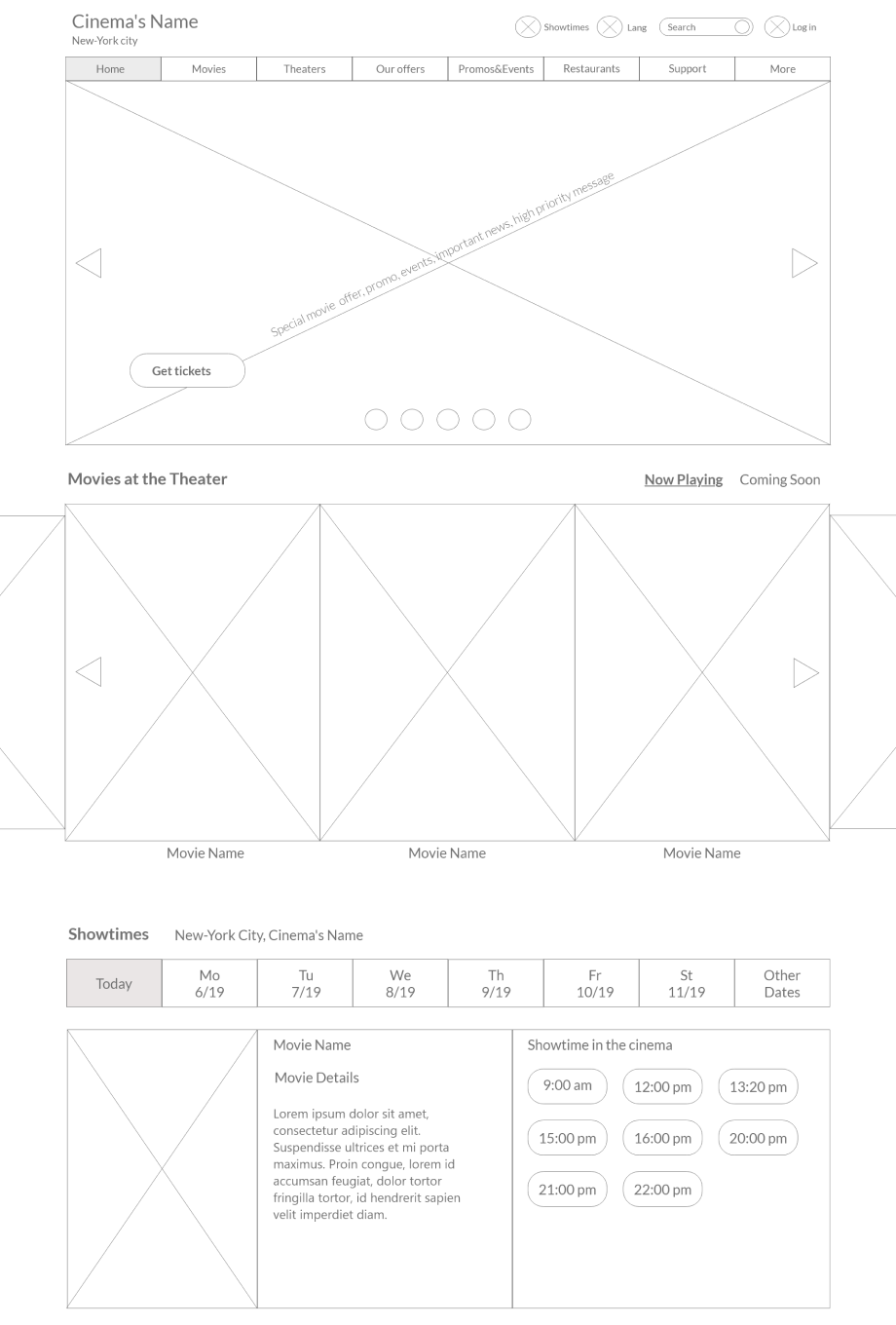
The user can see clearly where he/she is, location of the theatre, show times, language change and all info from the theatre
The most important messages from the cinema (promos, events, discounts, hot offers, etc. The action button signals about the possible action.
(cinema’s message with top priority)
(cinema’s message with top priority)
The user can find showtimes easy and also get the first info about the movie. It can also be an entry point to learn about the movie more
The user can find current and upcoming movies right on the main screen.
The movie posters carousel doesn’t take too much space but allows to get the first impression about the movie by looking at great quality pictures in a good big size, so user can see every detail on the picture easily.
The movie posters carousel doesn’t take too much space but allows to get the first impression about the movie by looking at great quality pictures in a good big size, so user can see every detail on the picture easily.
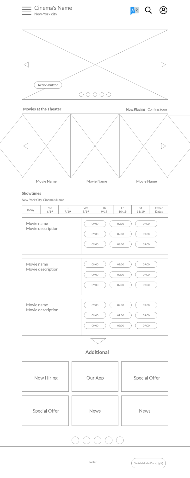
Digital wireframe screen size variations
Here you can see the design for a mobile and tablet devices for those who prefer it to desktop.
The main goal was to let users with such devices have the same experience using the website without losing usufulness of the original version.
This was achived by using hamburger menu and resizing carousels.
The main goal was to let users with such devices have the same experience using the website without losing usufulness of the original version.
This was achived by using hamburger menu and resizing carousels.
Low-fidelity prototype
To create a low-fidelity prototype, I connected all the screens involved in the primary user flow of buying a movie ticket.
At this point, I had received feeback on my desing from members of my team about thing like placement of buttons and page organization. I made sure to listen to their feedback, and implemented several suggestions in places that addressed user pain points.
View Lo-Fi Prototype
At this point, I had received feeback on my desing from members of my team about thing like placement of buttons and page organization. I made sure to listen to their feedback, and implemented several suggestions in places that addressed user pain points.
View Lo-Fi Prototype

Usability study
Study type:
Unmoderated usability study
Unmoderated usability study
Participants:
5 participants
5 participants
Location:
United States, remote
United States, remote
Length:
20-30 minutes
20-30 minutes


Usability study findings

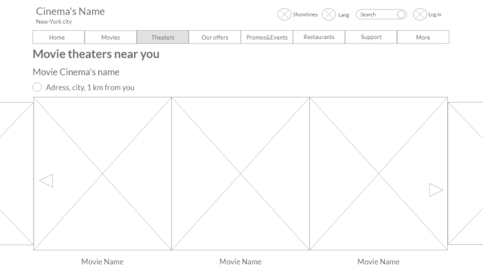
View on map option
Users want to be shown the movie theater’s location on map

Reminder for saving money
Users want to be reminded about opportunities to save money and get the most recent information for discounts and special offers

Shopping chart
Users want to have an option to open the shopping basket to check what they are going to buy later.
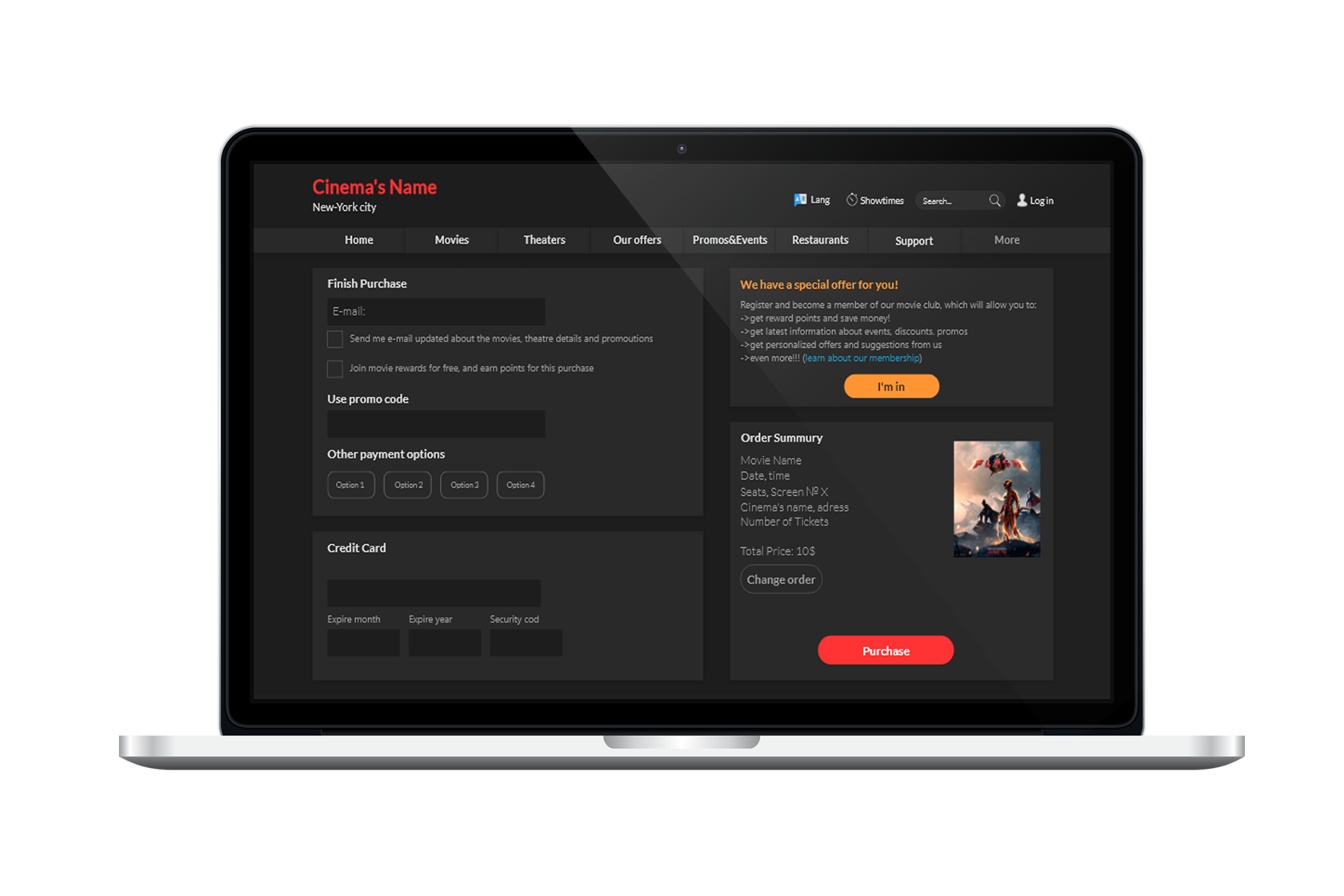
Mockups
Based on the insights from the usability study, I added an option to find the movie theatre on map by adding an icon with a map and text “view on map”. This allowed users to get better understanding of the theatre's location.
Try High-Fidelity Prototype
Try High-Fidelity Prototype
After usability study
Before usability study
I also added a reminder for users to join the theater’s membership, so they can earn reward points and save money, get latest info about discounts, special offers, events, promos, personalized offers and suggestions..
After usability study
Before usability study


Screen size variations
I included considerations for additional screen sized in my mock-ups based on my earlier wire-frames. Because moviegoers buy tickets from a variety of devices, I felt it was important to optimize the buying experience for a range of device sizes, such as mobile and tablet so users have the smoothest experience possible.


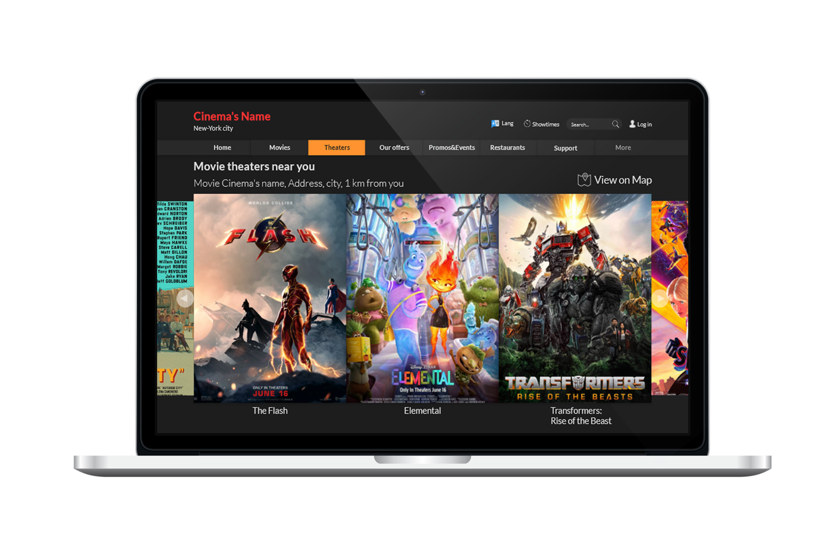
High-fidelity prototype
My hi-fi prototype followed the same user flow as the lo-fi prototype, and included the design changes made after the usability study, as well as several changes suggested by members of my team.
View the Movie Theater’s
View Hi-Fi Prototype
View the Movie Theater’s
View Hi-Fi Prototype

Accessibility considerations

Takeaways

What I learned:
I learned how to empathize with people better
I gained a new understanding of user centre approach
I learned how to create a detailed competitive audit
I understood how to conduct a good user research and why it’s a very improtant part of the UX process
I gained skills to create low and high-fidelity prototypes in figma.
I gained an understanding of accessibility benefits

Impact:
"I just enjoy how easy and straightforward the buying movie tickets process is"
Participant A
"I love to spend time with movie related content and this app made it possible for me"
Participant B
"The design is easy to understand and pleasant to spend time with, so I’m not overwhelmed with all new information and feel comfortable buying tickets online"
Participant C


